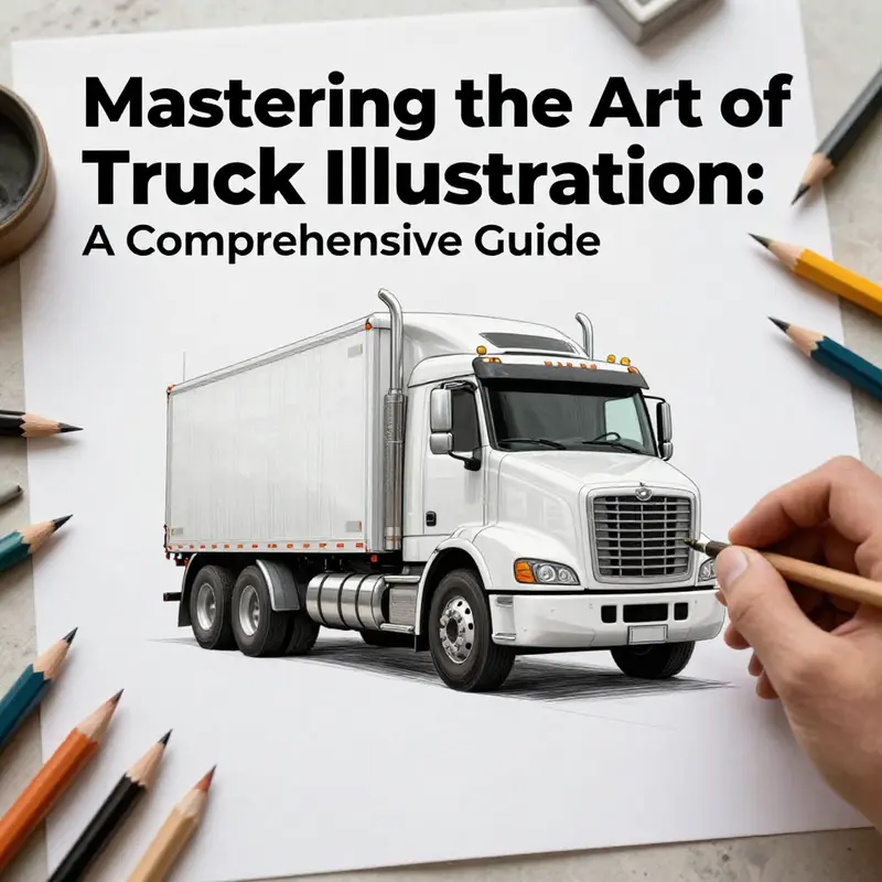
Illustrating a truck may seem daunting, but with the right approach, anyone can achieve captivating and realistic results. This guide is tailored for business owners interested in visually representing their brand through custom truck illustrations. By understanding key observational techniques, structuring basic forms, adding realistic details, and mastering color application, you can create stunning truck drawings that reflect your vision. Each chapter builds upon the previous one, making it easy to follow along regardless of your artistic skill level. Let’s explore how to transform simple sketches into dynamic representations of trucks.
null
null
Tracing the Road-Worthy Skeleton: A Deep Dive into the Truck’s Basic Form
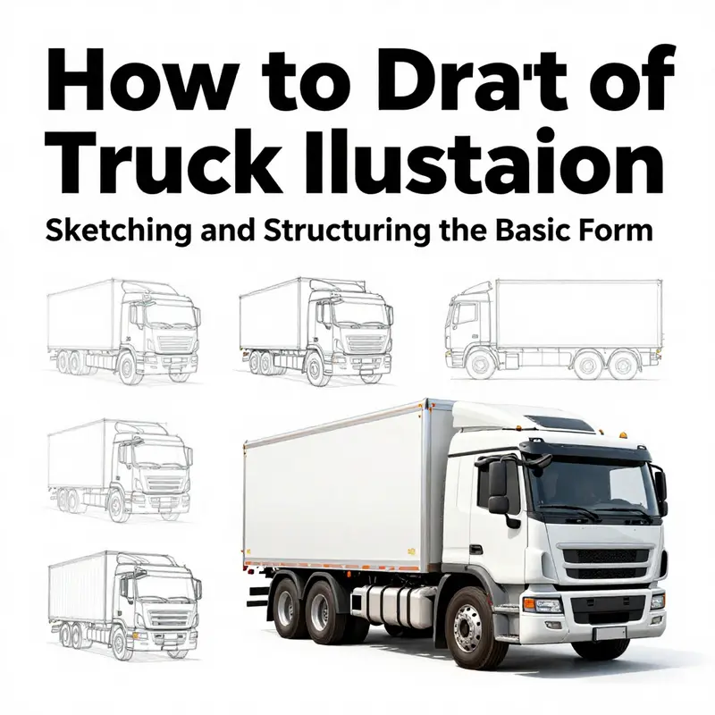
Drawing a truck is as much about reading its structural language as it is about rendering lines on a page. The vehicle’s presence comes from a precise interplay of shapes, proportions, and light. When you approach a truck with patient eyes and a steady hand, you’re not just copying a silhouette; you’re translating rhythm, balance, and purpose into a two-dimensional frame. The journey from a blank sheet to a convincing truck begins with a careful study of its fundamentals, then proceeds through a careful build—from a light scaffold to a confident, three-dimensional realization. In this chapter, we move through observation, construction, refinement, and finishing touches in a seamless flow that mirrors the way the best sketches evolve in real time. You’ll notice that the method remains deliberately simple at each stage: observe, establish, refine, and color. Reach for reference images, study the cab’s curvature, the cargo area’s length, and the wheelbase’s relationship to the vehicle’s stance. The goal is not to memorize a single exact shape but to internalize a reliable set of relationships that you can adapt to any truck you choose to draw.
The process starts with seeing. A truck is a composite of basic forms: a cab that sits atop an engine bay, a long container for cargo, and wheels that anchor the whole machine to the ground. The cab is not a rectangle floating in space; it’s a rounded box with planes that meet at angles where the windshield, doors, and roof form a coherent silhouette. The cargo area is a larger, more rigid mass—often a rectangular prism—that stretches behind the cab. In three-quarter or profile views, the relationships among these masses determine the truck’s overall proportion and its perceived weight. Observing a variety of trucks from different angles helps to internalize those relationships. Start by studying the way a cab narrows toward the top, how the windshield plane cuts across, and where the hood ends and the grille begins. Look at how the cargo bed or box aligns with the roofline and how the wheels tuck into wheel wells, leaving just enough clearance to suggest mobility.
With your eye trained, prepare a clean, light sketch on paper. Use a graphite pencil, and let your lines flow with a confident, loose hand at first. Begin with a ground line—the horizontal anchor that tells you where the road sits. A straight, light line across the bottom of the page sets the stage for perspective and depth. From there, map the basic proportions with simple geometric blocks. For the cab, use a rectangle or an elongated trapezoid to reflect the boxy shape; for the cargo area, draw a larger rectangle behind it. Keep these forms deliberately simple. This is not the final answer but a scaffold you’ll refine. A single vertical or diagonal axis through the center can guide symmetry, especially when you plan to add a windshield, doors, and mirrors. If you’re drawing in profile, your perspective lines will converge toward a vanishing point, and you’ll adjust the shapes to hint at foreshortening. If you’re drawing in a three-quarter view, you’ll orient the major planes to suggest depth while preserving the cab’s characteristic angles.
Proportion is the quiet engine of realism. Set a rough ratio before you begin adding details: the cab’s height relative to the cargo area, the length of the cargo bed compared to the wheelbase, and the diameter of the wheels relative to the body’s height. These ratios are not fixed laws; they are guidelines that keep your drawing coherent. In many trucks, the cab’s height is about one-third to one-half the total height, and the cargo box often runs longer than the cab is tall. The wheelbase—the distance between the front and rear axles—helps define the truck’s stance. A longer wheelbase yields a more balanced, relaxed look, while a shorter one can convey aggression or compact utility. Remember that perspective can dramatically alter perceived proportions. A three-quarter view makes the front appear larger and the rear recede, while a pure profile emphasizes length and silhouette. Take a moment to compare several reference images side by side and note how the same truck changes when viewed from different angles. The goal is to hold a mental map of these shifts so your lines can capture the moment of truth in the moment you draw.
As you translate the blocky forms into a connected body, the edges begin to matter. Start linking the cab to the engine bay with rounded transitions that imply a real seam rather than a rigid corner. The hood line should curve gently toward the grille, and the windshield should integrate with the roof plane smoothly. The cargo area requires its own set of careful connections: the back edge, the top seam, and the wheels’ wheel wells all contribute to a believable mass. When you connect the major forms, you’re shaping the truck’s overall rhythm. A well-handled rhythm makes the vehicle look grounded, even before you color it. If the silhouette feels stiff, soften a few lines where the cab meets the hood or where the cargo box meets the cab. Real vehicles have a gentle interplay of planes rather than perfectly flat edges. The line weight can help communicate this. Lighter lines convey preliminary stages and soft corners, while darker, crisper lines cement the final outline. Use this variety to guide the eye along the vehicle’s form and invite the viewer to move across the page.
One of the subtle challenges of truck drawing is capturing the wheel wells and the tires with believable depth. Wheels anchor a vehicle in space; without them, the truck can look like a schematic rather than a real machine. Start with two circles for the wheels, aligning them along a shared baseline. The front wheel is usually partially hidden by the wheel well; the rear wheel often sits slightly behind or beneath the cargo area, depending on the perspective. The tire tread, the rim, and the hubcap add texture and personality but should be suggested rather than over-revealed in the early stages. The space between the wheels and the vehicle’s body should be visually accurate enough to imply suspension without turning the drawing into a mechanical blueprint. A small amount of shadow where the wheels meet the ground reinforces contact with the road and adds a touch of gravity to the composition.
Details begin to emerge once the broad masses and the wheel placements feel stable. Doors, mirrors, headlights, and the grille are not mere decorations; they are the signs of character that tell you what kind of truck you’re drawing. The cab doors can be hinted at with slight vertical lines or faint changes in shading to suggest the door seams and handles. Side mirrors dutifully extend from the A-pillars, curving away from the cab’s edge to catch light. The grille, a defining feature of most trucks, is typically a grid or a set of vertical and horizontal bars that break the broad front plane into a readable pattern. For realism, keep the grille proportional to the cab’s width and height; overly large or tiny grilles distort the impression of mass. Headlights shape the front’s personality; some trucks have rectangular lamps, others have round ones, and a few sport distinctive shapes that echo the design language of the manufacturer. In all cases, the headlights should sit within the front fascia in a way that respects the vehicle’s geometry. Details like door handles, rivets on the cargo box, seams along the panels, and the tire treads add microtextures that reward careful observation. It’s tempting to rush these moments, but the most convincing sketches often hinge on the right balance between large forms and careful, smaller cues.
As you refine the line work, test how the drawing reads from a distance. Step back a few feet and squint at the composition. If the silhouette feels off, you can adjust the major lines rather than chasing every tiny detail. At this stage, you want a clean, readable contour that communicates a truck’s mass and proportion. The silhouette matters because it is the first and most enduring impression. If the outer edge carries a strong, confident shape, the eye can trust the rest of the drawing to fill in the interior details. Conversely, a jagged or inconsistent edge immediately signals that the artist is still constructing rather than presenting a finished image. When you achieve a smooth, believable outline, you can revisit the interior lines to sharpen essential features such as the windshield’s curvature, the door windows, and the back edge of the cargo box.
With the structure solid, the next phase moves from form to light. Shading is not merely coloring; it is an understanding of how light travels across planes. Consider a light source from the upper left. The top planes of the cab and the roof will catch light, the sides will fall into shadow, and the rims of the wheels will hold some brightness to suggest metal. Use a gradual scale of shading from light to dark to model the truck’s volume. A metallic paint or a glossy surface will reflect highlights differently from matte paint. If you’re using markers or colored pencils, apply broad, even gradients for large planes and reserve fine, directional strokes to indicate curvature along the hood and cab. The goal is to achieve a believable three-dimensionality without over-rendering. Subtle reflections on the windshield or chrome accents on the grille can give the sketch life, but avoid turning the drawing into a photo reel. Keep a balance so the drawing retains its hand-made character while still reading as a credible vehicle.
Color comes last and can dramatically shift the mood of your truck. Color choice should reflect the setting you want to imply: urban daytime, dawn light, or the commercial grit of a fleet on the highway. Metallic grays, deep blues, and bold reds are common in truck aesthetics and can be executed with a few layered passes to mimic gloss and depth. Color not only fills the mass; it enhances the sense of material. Metallic paints catch light differently from flat paints, so you’ll want to add subtle white highlights on curved edges and around protruding elements like the cab’s curves and the cargo box’s corners. Don’t forget tiny color cues such as the license plate framing, the glass tint of the windows, and the rubber of the tires. A well-chosen palette makes the drawing feel grounded in the world it depicts and invites viewers to linger on the lines you labored to perfect.
As any artist who has chased a convincing mechanical form knows, practice is the key that unlocks freedom. Start with a single truck from one angle, then switch to a different angle to challenge your construction habits. Draw the same subject multiple times, but vary the proportions slightly to learn how perspective changes the feel of the truck. Build a mental library of reference shapes—cab, hood, grille, cargo box, wheel wells—that you can remix for future sketches. In time, you’ll find you can translate what you saw in real life into a line drawing with greater ease, speed, and confidence. The bones of your truck will no longer be a mystery; they will be a set of intuitive cues that your pencil can easily follow.
If you want a structured path to follow while you develop your own approach, you can consult another beginner-friendly routine that aligns with these principles. It can provide a practical checklist that helps you stay mindful of silhouette, proportion, and line work as you sketch. For a related, structured walkthrough, you might explore a dedicated tutorial that walks through the process with visuals and step-by-step prompts. This additional resource complements the approach outlined here by reinforcing the progression from rough forms to finished detail, all while keeping the focus firmly on the fundamentals that matter most: the cab’s character, the cargo area’s scale, and the vehicle’s grounded presence. To see a comparable step-by-step approach, you can reference an external guide that emphasizes the core sequence from initial observation through completing the drawing.
For a further practical glimpse into related concepts and related topics on truck design and equipment, you can explore resources that discuss practical aspects of truck components and layouts. A real-world reference to consider is the topic of truck boxes, which are a common aspect of many vehicle configurations. This resource offers detailed context about how cargo spaces are designed and accessed, which can inform how you depict the back end of a truck in your sketches. truck box.
As you round out the drawing, remember that the goal is not a flawless replica but a convincing representation that captures the truck’s essence. The cab’s silhouette, the cargo box’s proportions, and the vehicle’s stance together tell a story of mobility, utility, and presence. When you finish, you should feel that the sketch communicates not just the shape but the attitude of the truck: its readiness to roll, its function, and its place on the road. With patience and repeated practice, your sketches will communicate the same clarity you see in real trucks, and your process will become a reliable workflow you can apply to any vehicle you choose to draw. The chapter closes not with finality but with ongoing invitation: return to observations, create new scaffolds, refine lines, and push light and color until your truck drawing feels as tangible as the real thing on a windy highway.
External resources for further guidance can offer additional perspectives and complementary approaches. For a beginner-friendly continuation that mirrors the steps described here, you may consult this external tutorial: https://www.drawdoodlelearn.com/draw-a-truck-step-by-step/
Breath of Steel: Elevating Truck Drawings with Realistic Detailing
Realism in a truck drawing arrives not from grand, dramatic strokes, but from the quiet accumulation of believable cues that ground the image in the feel of a working vehicle. Once you have the basic silhouette, the real work begins with how light plays across metal, how seams catch at different angles, and how small but precise elements tell a story about the truck’s purpose. This chapter invites you to lean into detail in a way that respects the overall form while letting your personal observation guide every mark you lay down. The path to realism is not about copying every bolt and badge from a reference; it is about translating the language of a real truck into marks your pencil can follow with confidence. The goal is not to overwhelm the eye with texture, but to invite the viewer to notice the crucial cues—the way glass catches a glaze of street light, the edge of a bumper that has absorbed a few scrapes, the stubborn thread of a tire that hints at off-road work, or the careful geometry of a grille that breathes with the vehicle’s character. Keeping this balance is the art of detailing, and it begins with a clear plan that respects the structure you have already established while inviting deeper observation into every nook of the drawing.
To begin layering realism, you can think of the cab area as a small stage where light and shadow perform a quiet, deliberate dance. Draw the windows with distinctly visible frames; let the glass show a subtle tint or a soft reflection of the environment rather than a flat, featureless pane. The windows are more than openings; they are planes angled toward the light source, and the frames provide rhythm to the face of the truck. The side mirrors, typically mounted on the door or the fender, are compact but crucial. Position them so they read as accurate components that influence the driver’s view, not as decorative extras. Their shape should align with the perspective you’ve chosen for the cab, and you can hint at glass distortions by a faint line of glare or a gentle color shift that echoes the surrounding scene. The mirrors’ value lies in their ability to convey function—an everyday tool that carries darker reflections and lighter highlights depending on where the light sits.
The grille and bumper deserve thoughtful attention because they anchor the truck’s front identity. Grilles often feature specific patterns—horizontal or vertical slats, mesh textures, or brand-inspired textures—and those patterns set the tone for the whole face of the vehicle. Rather than copying an exact model, study how light catches the gaps, how the chrome or plastic surfaces respond to illumination, and how the edges meet the hood and bumper with a crisp seam. The bumper, too, carries its own story: a durable shield that bears scuffs and minor dents from practical use. A few well-placed marks or a shaded crease along its lower edge can suggest impact, age, or repair, lending credibility to the image without overwhelming the composition with noise.
Moving to the wheels, the tires become a focal point of realism when treated with care. Tire treads are not simple circles; they are complex rhythms of grooves, sipes, and shoulder patterns that respond to the vehicle’s weight and motion. Draw the grooves with consistent depth and rhythm, avoiding a uniform, flat appearance. Subtle variations in the tread across the tire surface can imply wear, rotation, or terrain encountered by the truck. Hubcaps or wheel nuts give a sense of mechanical detail and depth, and a hint of chrome or metallic paint can catch light differently than the rubber. If you’re drawing a larger truck, such as a semi, you may want to peek beneath the wheel arcs and hint at suspension components—a few lines here and there that suggest springs, control arms, and the way the axle sits in space. These glimpses beneath the body can add a significant sense of realism by implying the vehicle’s structural complexity without crowding the scene with every mechanical part.
The chassis and undercarriage are often overlooked in quick sketches, yet they provide one of the strongest anchors for a believable drawing. Subtle lines can suggest frame rails, exhaust pipes, and the way the body sits above the wheel wells. These lines do not command attention; they support the main forms and help the viewer read the truck as a three-dimensional object. Think of the undercarriage as the quiet architecture of the drawing—the skeleton that lends rigidity and depth to the surface above. A careful touch here can prevent the drawing from feeling flat, especially when your light source comes from above. In practice, you can keep these lines restrained and slightly tucked away, only revealing them where a reader’s eye would naturally search and where your perspective demands a sense of weight.
Beyond the core geometry, the subtle, telling details accumulate to create a lived-in realism. Mudflaps that wink at the back of a wheel, license plates that sit with a small tilt, and reflective strips that catch an edge of light all contribute to a sense that this is a vehicle designed for real work. Weathering—scratches along the lower body panels, dirt smudges at the wheel wells, and the faint streak of rain-slicked metal under a door seam—softens the drawing into something that feels touched by time and weather. These details are not about flashy flash; they are about honest, quiet truth—the kind of cues that a viewer recognizes instantly because they reflect everyday experience with trucks in the world. When you place a weathered mark, think about its direction and intensity. A scratch or scuff should align with the truck’s motion or the path of a brushing contact, never appearing as an arbitrary dab of texture.
Layering is the practical mechanism for turning a clean line into a convincing surface. Start with light, broad shading to establish form and then gradually introduce darker tones to reveal depth. Use light shading to model the cab’s curved surfaces, the hood’s contour, and the wheel wells where shadow gathers. Build up the shading in stages, following the contours of the metal panels and the creases where panels meet. This approach helps avoid a sudden, heavy contrast that can read as a cartoonish highlight rather than a real vehicle. The goal is gentle transitions—soft gradations that emulate the way paint or metal reflects the light at different angles. You can also layer color in subtle ways, especially if you work with colored pencils or markers. A base gray can be warm or cool depending on the light, and a touch of blue or brown in the shadows can add depth without compromising the overall tone. In this way, you use color not as the sole cue for realism but as an amplifier of the form you’ve already built with pencil lines.
Color choice itself plays a crucial role in the realism of a truck drawing. Metallics respond differently to light than flat paints. A metallic gray, for example, can carry a crisp highlight on the hood and a richer midtone in the curved surfaces, while a deep blue or red metal finish can make reflections snap and brush across the body with a sense of vibrancy. When rendering finishes, consider not just the color but its temperature and how it shifts with the scene’s lighting. Cool light will push colors toward cooler versions, while warm light can coax yellowed highlights and amber glints on chrome or glass. The reflective quality of the surfaces—glass, chrome, and metal—requires attention to the direction and strength of the highlights. A small, bright specular spot on a chrome bumper can convey a polished surface, while a muted, broader highlight on a painted panel suggests a broad, diffuse reflection from a cloudy sky. By orchestrating these subtle shifts, you can achieve a convincing balance between form, material, and light that makes your truck feel present and tangible.
To make this discussion concrete, imagine the truck from a slightly elevated front three-quarter view. Your goal is to allow the viewer to read the cab’s volume, the length of the cargo area, and the weight distribution across the wheels in a single, steady sweep of the eye. In practice, this means you should keep the line work clean while you begin to introduce texture and depth in the appropriate places. Start with a light pencil for the outline, then layer on the details—windows, mirrors, grille, and bumper—so that the silhouette remains readable as you refine. Don’t rush to add every feature at once; instead, let the drawing breathe by alternating between lines and soft shading. Each addition should support the perspective and reinforce the vehicle’s mass rather than obscure it.
As you refine, you may discover that certain details deserve the attention of a separate pass. For instance, you can dedicate one phase to the cab area, another to the undercarriage, and a final pass to weathering and surface textures. This staggered approach helps prevent fatigue from clouding your judgment about proportions and can make the final result more cohesive. A helpful habit is to review your drawing in steps, stepping back to assess the balance between light and shadow, the accuracy of the wheel positions, and the readability of the details you’ve added. If something fails to feel right, it may be a matter of scale, perspective, or tonal relationship rather than a need for more marks. Returning to references or making a small corrective sketch can realign your drawing with reality without erasing your entire effort.
Observation remains the backbone of realism. Look at how an actual truck’s light catches its chrome parts differently from its matte finishes, and how the paint reflects its environment in short, sharp highlights. Try comparing your drawing to a real image and notice where your marks deviate: do the wheels seem too close to the cab? Is the grille pattern too coarse or too fine for the scale? Are the weathering marks too uniform, lacking the irregularity that characterizes real wear? Your answers will guide you toward a more faithful rendering. The aim is not to replicate every minute detail but to capture the essence—the way the truck reads under light, the way its materials respond to touch and weather, and the way its silhouette communicates its purpose at a glance.
To deepen your exploration of practical details and their integration into a complete drawing, consider exploring additional resources on truck accessories and storage elements. For example, you can learn how functional features like racks, boxes, and compartments influence a truck’s exterior rhythm and silhouette by examining resources such as this guide on truck boxes. The small but distinct shapes of such accessories can help you study how lines and planes interact at the edges of the vehicle, reinforcing your understanding of form and perspective while enriching your drawing with believable utility elements.
When you’re ready to transition from pencil to color, keep a disciplined approach to layering and shading. Work from light to dark, and from general shape to specific texture. Allow the color to enhance, not overshadow, the form you have established. Remember that lighting conditions dramatically affect color perception. A scene bathed in golden hour light will drape the truck in warm tones and soft reflections, whereas a scene under harsh noon sun will strip away subtlety, leaving crisp contrasts and sharper highlights. In either case, the realism will emerge from your careful attention to how color interacts with form, light, and texture rather than from color alone.
Finally, a note on practice and incremental improvement. Realistic truck drawing is a skill that grows with deliberate repetition. Build a small library of reference images that showcase different cab designs, grille patterns, wheel configurations, and weathering styles. Practice zooming in on each detail: a window frame here, a tire tread there, a patch of dirt by the wheel well. Over time, you’ll notice your eye catching the precise cues that matter and filtering out those that do not. Your sketches will become less about chasing exact replicas and more about translating the spontaneous judgments you make as you observe into clean, confident marks on paper. The result is a drawing that not only resembles a truck but also feels alive with the quiet authority of a machine designed to perform, carry, and endure.
For those who want to see these ideas in action across a broader range of vehicles and to study the interplay of panel lines, textures, and functional details, this extended visual guide on drawing a garbage truck offers clear illustrations and tips that can sharpen your eye for detail without overwhelming your process. Explore it for a focused example of how to balance structural accuracy with surface realism while maintaining comfortable, readable line work.
If you’d like to dive deeper into practical touches you can reference in your own drawings, consider this related resource on truck accessories that discusses how storage solutions and add-ons affect the vehicle’s exterior geometry and proportions. It’s a useful companion when you want your rendering to suggest not just a static likeness but a working tool that exists in the real world. truck boxes
External resource: For a step-by-step visual guide with clear illustrations that reinforce the approaches described here, see https://www.wikihow.com/Draw-a-Truck
How to Draw a Truck: Color Application and Finishing Touches
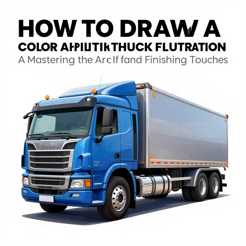
Color brings the truck to life, but the real artistry lies in how you apply it and how you finish the surface to suggest weight, texture, and weathered realism. When you reach this stage in your drawing, you’re not simply adding color; you are sculpting light, material, and presence. The cab’s metal sheen, the cargo box’s hard edge against the sky, and the rubber of the tires all demand different handling. The approach should feel like a conversation between your eye and your pencil or brush, a conversation that acknowledges the truck’s mass and purpose while honoring the subtle cues that let a viewer read the vehicle at a glance. As with the earlier steps, let observation guide you. Study photographs or videos of trucks moving in daylight and in shadow. Note how the sun catches the chrome on the bumper or the rivets along the seams. Track how the white of a trailer reflects nearby surroundings and how the tires absorb the road’s dust and moisture. This kind of visual analysis is the compass you’ll rely on as you decide how to render color and light.
Choosing tools is the first practical decision. Markers offer bold, graphic coverage that can resemble commercial paint. Colored pencils deliver smooth gradients and soft transitions, ideal for subtle shading on curved surfaces. Watercolors can give a fluid, painterly feel that suits weathered trucks or scenes with diffuse light. You might mix tools at different stages: markers for solid base coats, colored pencils for texture and fine gradients, and a touch of watercolor to suggest reflections on a wet day. Start with a clean, white or very light surface so you can layer without fighting the page’s brightness. A light underdrawing acts as a safety net; it ensures your placement remains correct as you deepen color. As you color, keep your edges deliberate. Trucks live in a high-contrast world: chrome gleams, paint zones block light, and the tires anchor the vehicle to the ground with a heavy, matte texture.
Begin with the base colors. Treat the cab as a focal point, using a solid, well-chosen shade that communicates the truck’s identity or function. A bold red might evoke a durable service truck; a deep blue can imply a long-haul class; a metallic gray might suggest a modern, stoic fleet vehicle. The cargo box or trailer should harmonize with the cab but also provide contrast to help the silhouette read clearly. White, cream, yellow, or black are common choices for commercial trailers, but the exact pairing should reflect the scene you’re building and the character you intend to convey. Test swatches on a scrap area or a separate sheet to compare how colors interact with light and with one another. Real trucks rarely present a single, flat tone; even a simple color will reveal its depth through subtle shifts in shade along the cab’s edges, atop the roof, and along the cargo box’s corners.
Layering is essential for depth. After laying the base coats, begin to build dimension with shading. Place the darkest tones along the sides, under the truck’s overhang, and near any recessed features such as door handles, grille openings, and the undercarriage. Remember that the light source dictates where shadows fall. If the sun is high, shadows will be sharp but brief; if the light is low, long, soft shadows can stretch under the truck and onto the ground. Use cooler tones for shadows to push them back in space and warmer tones for highlights to bring forward the surfaces that catch light. This interplay between warm and cool values strengthens the three-dimensional illusion and prevents the drawing from appearing flat. When shading the cab, consider how the windshield and windows alter color perception. Glass can pick up reflected skies, nearby signs, or the horizon, so you might see a tint or a slight color shift at the edge of the glass.
Highlights are the high-voice notes of your color harmony. Apply lighter tones on the top surfaces where light lands directly: the crown of the cab, the top edge of the cargo box, and the roof glints. Avoid overdoing highlights, though; a single bright edge can be enough to suggest a metallic surface without blinding the viewer. For chrome accents—bumpers, grilles, mirrored trim—think of them as reflective shelves. Your light source could be a strong sun, a cloudy sky with patches of brightness, or even streetlights if you’re rendering a night scene. In any case, use small, quick strokes or a fine line to imply the reflective nature of metal rather than coloring chrome as a flat, solid block. A pale sweep along the bumper can simulate a gleam, while the grille’s bars may benefit from a slightly brighter edge on the top side of each bar to indicate light slipping across metal.
Texture is the secret ingredient that keeps a drawing from feeling flat. Tires demand a dense, textured tire tread; the rubber’s matte finish contrasts with the slickness of paint. You can simulate tread by layering short, curved lines following the wheel’s circumference or by using a stippling motion to hint at tiny rubber nodules. The wheel rims deserve their own discipline: chrome or silver tones should have crisp edges and a cool reflection. You can imply oxidation and wear on rims with faint, irregular tonal variations that suggest scratches or patina. The cargo box should feel sturdy and hard, with edges that read as solid planes. While shading, consider adding subtle seams or rivets where the metal panels meet; these small marks catch a light irregularly and break the surface into believable segments. Reflective tape along trailer sides is another nuance that can lift realism. The tape should be a bright, slightly cooler white with a crisp edge and a tiny sheen that hints at a plastic surface under light. If you’re depicting weathered paint, you can introduce faint streaks and dust along the lower panels, where dirt tends to accumulate. Subtlety is your ally; a few careful marks can convey years of exposure without overwhelming the main color story.
Details sustain the illusion of realism. Doors, mirrors, a grille pattern, license plates, and the fuel cap are not mere afterthoughts; they are architectural cues that help the viewer read the vehicle’s construction and function. The mirrors should reflect the environment in a distorted, slightly curved way, echoing their convex shapes. The grille’s geometry—whether it’s large or narrow, the spacing of bars, and the bonding edges—will catch light differently than flat surfaces. Don’t forget to add tiny but telling touches: rivets along joints, seams that catch a thin line of light, and even tire treads that run along the circumference. In a full-color drawing, these micro-details become a chorus that supports the larger color composition. A crisp, clean line around a panel seam often benefits from a fine-tipped pen or a sharpened white pencil to highlight the edge where two surfaces meet. After you finish coloring, scan or photograph your drawing to evaluate how the color reads at a distance. Sometimes a color that looks right up close will appear muddy or washed out when viewed from afar; the digital or printed version can reveal this balance issue, and you may need to adjust it with another pass of color or a light touch of white to restore contrast.
As you near completion, consider how you’ll present the truck within a setting. A simple background can push the vehicle forward or place it in a story—on a sunlit highway, at a loading dock, or outside a warehouse. A shallow horizon line and a soft wash of color behind the truck can imply depth without pulling attention away from the vehicle itself. If you want a more graphic look, keep the background minimal but ensure it compliments the color scheme of the truck. The goal is to preserve readability and emphasis on the truck while allowing the eye to rest. When you’re satisfied with color and form, you’ll move into the finishing steps that sharpen the entire piece. Go over the major outlines with a fine-tip pen to crisp the edges and restore any lines that may have softened during shading. Erase stray pencil marks carefully so you don’t disturb the color layers beneath. If you’re working digitally, compare brightness and contrast across the image. A slight boost in contrast can make the highlights pop and the shadows feel more grounded. The digital stage also offers a convenient way to balance color by adjusting saturation or hue globally, ensuring the cab and trailer harmonize even as their base colors differ.
Finishing touches extend beyond color to a sense of presence. Include small reflective cues on glass, such as a bright highlight along the windshield edge or a pinpoint reflection on the chrome of a bumper. These micro-touches communicate that light moves across a real surface. If you want to honor authenticity in a more practical sense, you can add stickers, license plates, or signage appropriate to the scene, but keep them subtle so they don’t steal attention from the vehicle’s form. A light layer of varnish or fixative (for traditional media) can protect your colors and keep your surface even, especially if you used a combination of markers and pencils. If you’re presenting the piece digitally, a final pass of contrast and brightness adjustments can help the colors sit correctly on different displays and in print. And don’t forget the final flourish: your signature. A small signature in a discreet corner confirms authorship and marks the moment you completed the work, turning a technical exercise into a personal achievement.
In this chapter you’ve moved through color selection, base application, depth, texture, and final polish. The goal has been to translate not just the truck’s appearance but its essence—the way it stands on the road, its mass, and the careful engineering that makes it work. For readers who want a deeper reference as they color, a compact, hands-on resource can offer additional tips and demonstrations. A helpful path is to explore an accessible tutorial that walks through truck coloring step by step, enabling you to compare techniques and borrow ideas you can adapt to your own style. If you’re curious about how color theory and practical layering intertwine in vehicle art, consider integrating a resource like a dedicated coloring guide. And as you experiment, you might discover that pairing a strong base with thoughtful highlights and subtle textures yields a result that feels both bold and believable. If you’d like to explore related topics such as how to render the entire vehicle’s exterior with detailed components, you can consult the broader guide on truck accessories and assemblies. For further reading and practical guidance on color technique, check the external reference linked at the end of this chapter. In the meantime, your drawing stands as a testament to a careful, patient process—one that starts with observation and ends with a confident, finished depiction of a truck ready to roll off the page. Accessories
External resource: https://www.drawdoodle.com/drawing-tutorial-truck-coloring
Final thoughts
Creating a truck illustration is an enriching experience that can enhance your business’s visual identity. By mastering observational techniques, structuring your form effectively, adding intricate details, and applying color skillfully, you can achieve compelling illustrations that serve your business’s branding needs. With practice, these skills can help convey your unique message and connect with your audience meaningfully. So pick up your pencil and start drawing the truck that embodies your vision!