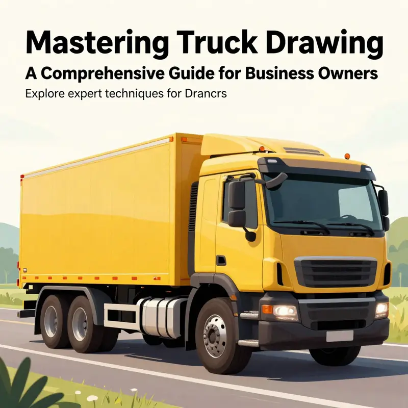
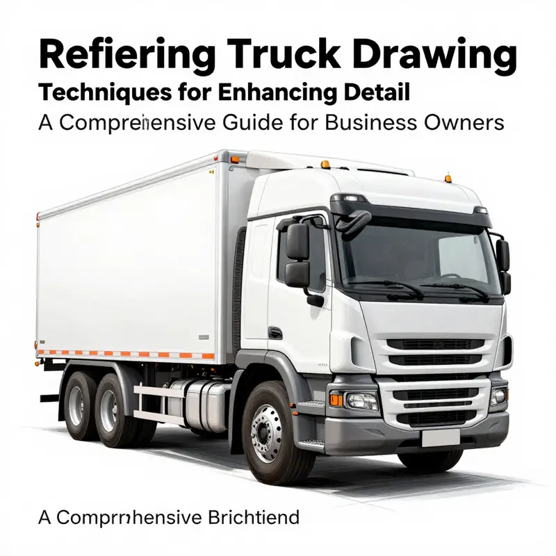
Drawing a truck is not only an enjoyable creative endeavor, but it can also be a significant asset for business owners looking to convey mobility and service in their branding. This guide will provide you with essential steps to create a basic yet visually appealing truck drawing. Throughout the chapters, we will cover the fundamental shapes involved, techniques for adding detail, refining your artwork for a professional touch, and applying colors and shading to give your truck illustration depth. By the end of this article, you’ll be equipped with the skills required to produce an effective truck drawing that aligns with your business identity.
From Simple Shapes to Street-Ready Trucks: A Fluid Guide to Drawing Trucks
Drawing a truck is less a sprint of dazzling skill and more a patient translation of real form into confident line. The secret lies in seeing a vehicle as a sequence of simple blocks that can be arranged, proportioned, and then reimagined until the model sits naturally in your chosen perspective. When you approach it this way, the act of drawing becomes a conversation between imagination and observation, not a race to replicate every tiny detail. Start with a plan in your mind and then let your pencil flow along that plan, step by step, like laying bricks for a small building that will someday carry a load of ideas and color.
The foundation of any truck drawing is the chassis, the long body that runs from the front toward the rear. In practice, you begin with a single long rectangle that hints at the cargo area or trailer. It helps to keep this shape horizontal and slightly elongated, so the vehicle reads as sturdy, not squat. If you want a hint of realism, let the front edge taper a touch to suggest the hood; this tiny adjustment can dramatically alter the truck’s personality, turning a blunt box into something with character. From there, the logic of construction continues with the wheels. In a side view, you’ll place two front wheels near the front of the chassis and two more toward the back. The wheels anchor the drawing, so aim for even size and alignment; they should feel as if they could roll away with a gentle push, not float above the surface. The key is to keep them proportional to the chassis while respecting the overall length you’ve chosen for the truck.
Above the front portion of the chassis rises the cab, the driver’s compartment. This is your second block, a smaller rectangle or a trapezoid that tilts upward a touch. The cab’s silhouette should communicate where the windshield and doors live, but you don’t need to overcomplicate it yet. A simple roof line, perhaps a slight slope, is enough to give the truck a recognizable silhouette. Inside that cab block, imagine a large windshield taking up most of the front face, with smaller windows below it. The windshield’s angle helps convey the vehicle’s stance and the way light will interact with the glass. Small details like side mirrors and the door handle begin as tiny rectangles or ovals placed near the cab’s edges. Treat them as accents rather than burdens; they should support the overall shape without stealing focus from the primary volumes.
The front section, including the grille, bumper, and hood, is where the drawing starts to gain its expressiveness. A hood line runs from the top of the cab toward the front edge, suggesting the engine’s shape beneath. Add headlights as simple shapes—small circles or rounded rectangles—placed along the front face where they would catch the most light. A minimal bumper can be represented by a slim line or a gentle U-shaped curve under the front wheels, helping anchor the vehicle to the ground. These features should feel like they belong to the same material and weight as the cab and chassis, not as if they were pasted on later.
Behind the cab, the cargo area expands the story of the truck. For a flatbed, sketch a flat, rectangular outline that sits above the chassis line, with diagonal lines crisscrossing to imply straps or ropes. For a closed box truck, you’ll emphasize the cargo area with a clean rectangular form that reads as a separate volume yet remains visually connected to the cab and frame. The lines of the undercarriage and frame deserve careful attention too. A long, quiet line along the bottom of the chassis helps ground everything, while small curves beneath the front and rear wheels hint at the fenders and tires’ three-dimensional heft. The whole composition should feel like a single, coherent entity rather than a sequence of disjointed parts.
With the structural skeleton in place, the drawing begins to breathe through refinement. This stage invites you to erase extraneous guidelines and darken the final lines, turning construction marks into confident contour. It is often helpful to go back over the drawing with a slightly heavier pencil or a fine pen to create a crisp, legible definition. Details that begin as suggestions—like a door line, a window seam, or the edge of the cargo bed—will take their place naturally once the main shapes have established their rhythm. The idea is to keep the drawing readable from a distance and let a viewer’s eye glide along the truck’s length, following the curves and straight edges without getting snagged on clutter.
Color and shading then bring the truck to life. While shading is not essential to the basic shape, it adds depth, weight, and a sense of mass. Imagine light striking the vehicle from a particular angle; shade under the chassis to imply shadow, and darken areas near the tires where space recedes. Widen the front grille slightly with a darker edge to give the front a sense of dimensional air, and shade the wheels with a consistent midtone to anchor them to the ground. When you color, choose a hue that suits the character you’re aiming for: bold colors can emphasize the truck’s utility and grit, while cooler tones can convey a more mechanical precision. If you wish, you can introduce subtle highlights on the windshield and metal surfaces to suggest gloss and reflective light. This is where a simple line drawing becomes a living, tactile object.
Practice illustrations many times, and do so with intention. If you are new to drawing a truck, begin with a straightforward side view and then gradually expand to additional angles—front, three-quarter, and rear perspectives. Practicing from reference images reinforces proportions and helps you translate real-world shapes into your own line language. It is not cheating to study. Real trucks, even crude mechanical drawings, reveal patterns—the way the cab’s lines intersect with the hood, the spacing between wheels, the ethereal rhythm of the cargo area. And when you feel ready, try variations: a semi-truck with a longer chassis and a taller cab, a pickup with a shorter bed, or a compact delivery van that presents more box-like geometry. Each variant challenges your eye to adjust proportion and perspective while keeping the core method intact.
A final note on approach: treat drawing as a process of simplification. Your mind can handle the complexity of a full truck only if you break it into approachable chunks and keep your lines purposeful. Light, exploratory strokes help you map the figure without committing too early. Once you are confident in the basic silhouette, you can layer on personality with details like side mirrors, hood ornaments, door handles, and roof racks. Even the simplest truck can feel complete when its silhouette, proportion, and lighting are coherent. The goal isn’t to replicate every screw and badge but to capture the vehicle’s essence—the way its mass sits on the road, the clean geometry of its surfaces, and the quiet tension of a design built for work.
If you want guidance that complements this drawing approach with a curated set of related ideas—such as how to customize a truck with practical accessories while keeping the lines clean—consider exploring our Accessories guide. It offers practical angles and tips for thinking about the vehicle as a platform for work and creativity. Accessories guide
As you continue to practice, your sketches will begin to feel less like exercise and more like storytelling. Each line you draw carries a decision about form, weight, and balance. Before you know it, you will be translating three-dimensional space onto two-dimensional paper with greater ease, turning a set of simple blocks into a vehicle that commands attention on the page. When in doubt, return to the core: a long, stable chassis; a compact cab perched above it; wheels that register with gravity; and a cargo area that completes the vehicle’s function. Let these principles guide you, and the rest will follow with patience and repetition.
For a visual step-through that mirrors this method, you can consult a well-illustrated guide here: https://www.wikihow.com/Draw-a-Truck
Foundations in Focus: Building a Truck Sketch from Simple Shapes
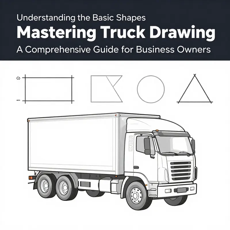
Drawing a truck begins with a philosophy of simplification. When you translate a vehicle onto paper, the first job is to strip it down to a handful of dependable shapes that describe its mass, balance, and silhouette. The body becomes a long, horizontal rectangle or a box-like form; the cab is a smaller block that sits toward the front to establish the driver’s vantage point; and the wheels are round anchors that declare the machine’s stance. This approach turns a complex machine into a clear map of relationships, allowing you to confidently adjust length, height, and width without losing the vehicle’s identity. As you sketch, keep in mind that the goal is not precision in every edge but believable proportions that convey weight and purpose. The transformation from box to truck is a matter of drawing the eye through the composition: the eye reads the rectangular main body as the backbone, the cab as the head, and the circles as the feet that keep everything grounded. The trick lies in keeping the edges honest enough to read as metal while preserving the soft, rounded corners that trucks naturally exhibit. A blocky start does not imprison your drawing; it liberates you to sculpt curves later, to lean into subtle angles where necessary, and to experiment with how light will play across a flat surface once the form feels steady in space. The beauty of beginning with these basic shapes is that your sketch remains legible even as you add personality through line weight, shading, and a few selective details. The process thus becomes a dialogue between structure and style, a way to respect the geometry while allowing room for artistic interpretation. When you’re ready to see this method in action, a practical example shows how a boxy engine housing, a compact crew compartment, and a cargo area behind the cab come together without crowding the page. For a hands-on reference that crystallizes these ideas, you can explore a concise walkthrough such as truck box guide, which demonstrates how the same blocks translate into a familiar truck form. This internal link serves as a helpful reminder that the shapes you start with are powerful building blocks rather than rigid templates, inviting you to adapt them to different scales and purposes while keeping the underlying geometry intact. From here, the road to realism becomes a matter of refining rather than reinventing, of letting the bulk of the vehicle speak first and then inviting the eye to notice the details that tell the entire story. As you practice, you’ll discover that the most convincing truck sketches balance simplicity with just enough nuance to imply function: the measured distance between the cab and the front end, the length of the cargo bed, the way the wheels tuck into fender arches, and the slight tilt of the roof that hints at the cab’s interior. These cues, simple in themselves, accumulate into a strong overall impression that readers can recognize at a glance. And because this approach anchors itself in universal geometry, it scales naturally across truck types—from compact delivery models to longer haulers and everything in between—without forcing you to relearn a whole new drawing language for each variant. The benefit of focusing on shapes is that you can sketch quickly and then decide whether the silhouette reads correctly from any angle. If you rotate the page or change the viewer’s distance, the same rectangle becomes longer or shorter, the cab’s position shifts, and the wheel spacing readjusts, all while preserving the core proportions that define the vehicle. This fluidity is essential when you want to capture dynamic poses, such as a truck turning a corner or parked on a slight slope, because the fundamental geometry remains stable even as the perspective shifts. You can also experiment with variations in the cabin’s size and the cargo area’s height to reflect different roles the truck might play, such as a heavy-duty hauler versus a compact service vehicle, all the while keeping the same set of shapes that started the drawing. The exercise thus becomes not merely about copying a vehicle but about building a robust, reusable toolkit for any future sketch. When you’re ready to add life, you’ll find that the simplification you started with makes it easier to place the finer elements, such as windows, headlights, and side mirrors, without cluttering the scene or breaking the linework. Windows in the cab can be treated as rectangles with a gentle inward tilt to convey glass that catches light, while a pair of small headlights can be suggested as simple rounded rectangles or circles at the front. Side mirrors emerge as compact blocks tucked near the top of the cab, and the bed behind the cab can be represented by a longer rectangular shape whose top edge aligns with the cab’s roofline. You’ll notice that these details no longer demand heavy, complex geometry; they ride atop the established shapes, adding character without destabilizing the proportions. As you push toward realism, you’ll learn to adjust the curvature of the cab’s roof, the taper of the hood, and the contour of the bumper to reflect the chosen model’s silhouette; yet the rules stay the same: start with a main body, add the cab, position the wheels, and then refine. It is this disciplined layering—shapes first, details second—that distinguishes confident sketches from hesitant doodles. The shade of a line can also be a guide. Subtle line weight changes help indicate where metal folds or where two panels meet. A heavier line along the bottom edge anchors the truck to the ground, and lighter lines on the upper contours imply softer transitions or chrome highlights. Shading complements shape without turning the drawing into a shading exercise; it narrates depth while preserving the crisp readability of the geometry. If you prefer color, a restrained palette can enhance the sense of material without distracting from the essential geometry. A matte body with slightly glossier wheels often reads as a convincing contrast that reinforces the geometric logic underneath. The key is to keep the drawing readable at small sizes; the shapes should still be recognizable even when your paper is reduced in a thumbnail representation. The habit of returning to the base shapes whenever a detail starts to look off acts as a quick diagnostic tool: if the finish seems crowded, you have likely pushed a line beyond the shapes’ natural proportions and must pare back to the core blocks. This approach not only yields better truck sketches but also cultivates a larger readiness to draw other vehicles. A truck, in its essence, is a rhythm of rectangles and circles arranged over a ground plane; the more you tune into that rhythm, the more quickly you can translate three dimensions into two. If you encounter perspective challenges, imagine the wheels resting on a shared horizon and use that line as a guide for where the main body sits. By cultivating this habit, you lower the barrier to experimentation and increase the likelihood that every new sketch will feel deliberate and cohesive. The journey from shape to silhouette is not about chasing perfection in a single pass; it is a dialogue between intention and adjustment, a process of repeated refinement that reveals the vehicle’s personality without sacrificing the clarity of its structure. For those who want to deepen this practice, maintain a steady cadence: sketch a few variations each week, compare them against real-world references, and note where the proportions shift and why. Embrace the balance between accuracy and expression, because a good truck drawing communicates its purpose through a confident, legible outline before it indulges in texture or color. Finally, to cement the habit, set a short, regular practice routine. Pick a quiet space, a clean sheet, and a pencil with a light lead. Start with the main body rectangle, place the cab, drop in the wheels, and then evaluate the silhouette against a quick grid. Use a ticking clock to encourage speed and confidence; speed helps you let go of perfection and focus on proportion. Gradually, push the shapes to mimic different truck types by adjusting the length, height, and window placement while keeping the same geometric logic. You can alternate between a cadenced, measured approach and a looser, expressive mode to learn how the same starting shapes accommodate stylistic shifts. Over time, your outlines become more decisive, and you find yourself able to adjust the perspective mid-drawing without breaking the overall balance. This iterative loop—draw, assess, adjust, and redraw—transforms a tentative sketch into a convincing portrayal of a truck, even when you’re working from memory or reference photos. External resource: https://www.wikihow.com/Draw-a-Truck
Detailing the Drive: How Small Clues Bring a Truck to Life on the Page
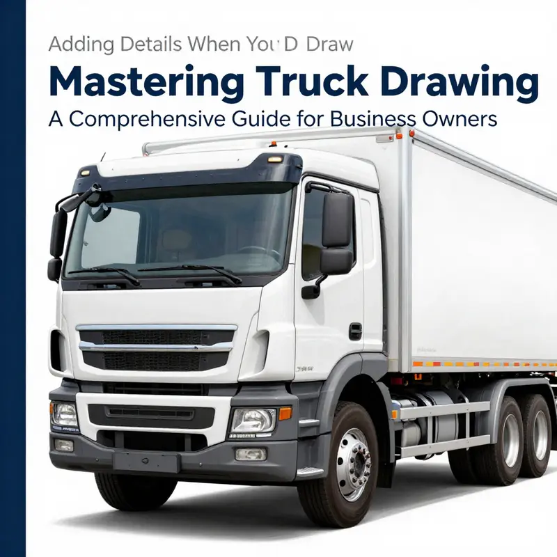
Detailing a truck on the page is about translating three core truths into pencil and ink: proportion, function, and atmosphere. The moment you pick up the drawing tool, your eye negotiates how the form sits in space, how light will carve through metal and glass, and how an ordinary truck becomes a story on a flat surface. That story begins with a careful, almost quiet discipline: sketch the proportions first, not the details. Start with the cab, the hood, the wheelbase, and the bed or trailer if you’re rendering a freight vehicle. Use simple blocks to establish volume. A common approach is to treat the cab as a rounded rectangle and the hood as a slightly tapered rectangle that blends into the grille. A two-point perspective helps keep everything grounded when the truck sits at a shallow angle, while a one-point approach can be useful for a straight-on view. The key is consistency. If the wheels are drawn as circles in the front, they should appear as ovals in the distance, and every line you add after that should respect that perspective. This foundational discipline pays off when you begin to layer in the more complex elements that give a truck its character.
From this solid skeleton, you can define the structural elements with a clear, confident set of lines. The cab and hood deserve particular attention because they carry a truck’s personality. The grille is not just a mouth for a machine; it is a grid of light and shadow that suggests power beneath steel. When you draw the grille, think in planes rather than a single texture. Use crisp horizontal and vertical lines to map the pattern, then soften the edges with subtle shading so the grille feels recessed rather than flat. Headlights are more than bright spots; they carry lens structure, reflectors, and the tiny distortions of glass. A good practice is to sketch the lamps with a few reflective highlights to suggest glass catching light from your chosen source. Windshield wipers can be delicate but essential lines that imply movement and daily use, while the windshield itself should catch a skim of reflection to convey glass and transparency.
The wheels and tires are where the drawing often betrays its level of finish. A convincing wheel starts with the rim, which can be illustrated with a spoke pattern or a clean alloy design. The tire tread is not a single texture but a series of grooves and wear marks that wrap around the curvature of the tire. Don’t forget lug nuts or a hubcap if your chosen truck style calls for them. The tire’s contact patch with the ground anchors the vehicle in space; shading under the wheel wells adds depth and prevents the form from floating. When you render the undercarriage and suspension, use lighter, cooler shadows to suggest space beneath the chassis. Small details like a visible brake rotor through a rim or a slight bend in a fender line can communicate realism without crowding the drawing.
Beyond the geometry of the vehicle lies the art of believability: the small, practical details that tell the viewer this truck lives in the world you’re creating. Mirrors and bumpers deserve thoughtful handling. Side mirrors should appear as reflective planes with mounting brackets—tiny but noticeable. Chrome trim on bumpers catches highlights differently than painted surfaces, so vary your light reflections to show metal’s lustrous surface against matte paint. The body panels and seams also matter. Fine lines that trace where panels meet and where doors align with the cab give the truck its mechanical honesty. Emblems and badges, even if you’re working from imagination, suggest provenance and scale. A maker’s logo, a company name, or a stylized slogan along the side rail can transform a static silhouette into a narrative vehicle.
Windows and glass deserve special treatment because glass interacts with light in distinctive ways. Draw windows with gentle reflections and soft edge highlights to convey transparency. Tiny imperfections—smudges, minor scratches, or a speck of dust—suggest usage and add life to the drawing. In a street scene, reflections of streetlights or nearby buildings can skitter across the glass, adding a sense of environment and time of day. That environment also lends opportunity to play with mood. A truck in rain might have glistening surfaces and damp wheel wells, while a sun-soaked highway can enjoy crisp, high-contrast edges and longer shadows.
Now consider the body panels, seams, and the way a truck carries its functional hardware. Panel joints and seams along the sides and roof should be indicated with careful, light lines that suggest where panels meet without becoming repetitive. If you’re illustrating a truck with a cargo box or a flatbed, think about how the tie-downs, latches, and braces would appear in real life. Emblems, decals, and manufacturer marks are not mere decoration; they are scale cues and storytelling devices. If you choose to place a logo on the grille or a name on the side, ensure it sits in harmony with the truck’s perspective and lighting. The same attention to lighting that informs the grille or the badge should guide taillights, brake lights, and any auxiliary lighting. The internal components of the lights—lens layers and reflectors—are worth a gentle emphasis because they anchor the eye.
As the drawing evolves, environmental cues begin to shape the final look. Dirt and wear, especially on the lower panels and wheels, can communicate the truck’s life and purpose. A coat of dust along the rocker panels or faint mud splashes on the tires can add realism without overwhelming the primary shapes. Shadows should be soft where light bleeds into curved surfaces and sharper beneath overhangs or under the chassis. Reflective surfaces, including chrome trim or metallic paint, respond to light with bright hotspots that travel along the edges and fade along the planes. These effects aren’t about showing off technique; they are about convincing the viewer that the truck exists in a world where light, texture, and weather interact in believable ways.
When you reach the refinement stage, you’ll notice a subtle but crucial shift. Line work becomes cleaner, with a finer pen or brush used to define essential features while erasing extraneous guidelines. Color and texture can then finish the illusion: metallic paints gain depth through gradient shifts, glints of light, and careful shading. A chrome bumper or a polished grille benefits from a bright, reflective edge while the surrounding painted surface remains slightly more matte. If you’re working in color, keep your palette cohesive across the vehicle so the details read as a single machine rather than a patchwork of bits. Texture can be simulated with stippling or crosshatching to suggest the roughness of rubber, the smoothness of metal, or the sheen of glass.
Background elements, though optional, help ground your truck in its world. A simple road line that disappears beneath the tires, a hint of distant street lamps, or a few silhouettes of passing vehicles can provide context without distracting from the main subject. If you want a practical hook for exploring functional details further, you can take a look at how different panels and components come together in real-world designs by following the concept of truck-specific hardware and accessories. For a concrete example of how panel seams and modular components might appear on a truck body, see truckboxes. This kind of reference can spark ideas for where a cab meets a cargo area, how a toolbox sits on the side, or where a ladder rack or roof rack could influence the silhouette.
Even with a strong grasp of structure and texture, the heart of a convincing truck drawing remains its observant eye. Use reference images when possible, but don’t become a slave to them. Allow your own interpretation to flow through the lines, especially when you are imagining a truck from a different era or a stylized design. The goal is to keep the proportions correct, the perspective consistent, and the details purposeful. A well-drawn truck demonstrates how you can communicate weight, function, and character with nothing more than lines, shading, and careful color choices. If you’re new to the craft, start with a single, clean view of a simple truck and gradually incorporate more elaborate features as your confidence grows. If you need a structured, step-by-step visual guide to accompany this approach, a reliable resource with clear images can be helpful for building a mental map of proportions and details. For a visual reference, consult the detailed guide available at wikiHow. Draw a Truck.
From Rough Sketch to Realistic Haul: Refining a Truck Drawing with Precision and Detail
The moment you move from a simple silhouette to a convincing truck lies in the steady refinement of form, light, and texture. It is a process that rewards patience more than bravado, a quiet discipline that turns a first scribble into a convincing vehicle with presence on the page. You begin not by rushing to add chrome and tires, but by anchoring the drawing in solid proportions and believable perspective. The aim is to hold your composition steady through a precise framework that lets the eye read the cab from the same rules of space you apply to the ground and the sky. A strong foundation keeps everything else honest, and it is the doorway to the more subtle decisions that breathe life into a drawing. When you study a real truck or a reference image, you can see how the cab, chassis, and cargo area relate to each other in three dimensions. The three-point perspective mentioned in more technical guides becomes less a rigid rule and more a rhythm you apply to your own view. If you are looking at a low-angle shot that makes the truck loom over you, the vanishing lines converge toward a distant point above the top edge of the cab, and the wheels sit along true horizon lines that reveal the vehicle’s stance. These cues help you preserve the truck’s mass and weight, so the rest—the windows, the grille, the tires—can be added with confidence rather than guesswork. Proportions are not a one-and-done calculation; they are a living agreement between the parts. The cab should feel like it could contain a driver’s space, with a window opening that suggests scale. The front end must align with the hood’s length and the grille’s height so that the silhouette reads as a consistent machine, not an assembly of floating shapes. Reference imagery is not a crutch but a compass. When you compare your sketch to a photograph or a drawing of the same angle, you begin to notice the relationship between the height of the cab and the length of the bed, or how the wheel wells swallow a portion of the tires with just enough space for a shadow under the chassis. The practical approach here is to establish a light, malleable grid—your initial construction lines—that you gradually replace with definitive edges. The lighter these lines remain, the more forgiving the process becomes. You can stand back often, assessing whether the cab looks correct in relation to the wheels and the bed, and whether the overall silhouette has the truck’s characteristic stance. The moment you sense a discrepancy, you can adjust the framework before you add any heavy shading or intricate detailing. As you refine, you may find it helpful to explore practical details that help your drawing breathe. For instance, thinking about how the exterior elements interact with light can steer your decisions about line weight and shading. The small features—headlights, mirrors, door handles, the grille—become focal points that either unify the drawing or distract from it. The larger challenge is to convey the vehicle’s surface as a continuous form, not an aggregation of planar shapes. Line weight is a useful instrument in achieving this unity. Start with thin, light contours for the outer edges and interior divisions, and employ thicker lines where you want to push the silhouette forward or emphasize a hinge, a seam, or the edge of a door. The variation in line weight can imply chrome, glass, or rubber without needing to color every facet. When you introduce texture, you switch from line work to controlled shading techniques. Hatching, cross-hatching, or stippling can model a curved surface and suggest the way light falls across a rounded fender or the ribbed texture of a tire. The trick is restraint: a few well-placed hatch marks around the wheel well and along the bumper can convey weathering, grime, or wear without cluttering the image. This is where the concept of volume becomes tactile. The tire’s tread isn’t just a pattern; it’s a cue about the wheel’s roundness and the plane of the ground beneath it. Subtle shading under the cab and along the bottom edge of the truck can imply shadows that anchor the machine to the surface, giving it gravity and mass. If you work with color, begin with a gentle base layer to establish the light source and then layer in mid-tones and shadows. The goal is to keep transitions smooth, so the form reads as a solid block rather than a mosaic of flat panels. Even with color, the underlying values matter more than the hue. A light-to-dark progression helps reveal the curvature of the cab and the slope of the hood, while darker tones inside the wheel wells convey depth and dimensionality. As your shading builds, think about how color can selectively emphasize features without overpowering the drawing. A cool shadow can make a warm highlight feel more luminous, and a controlled color contrast can bring certain details into sharper relief. If you move into digital media, you gain the advantage of layering and blending modes that let you experiment with lighting without committing to permanent marks. A separate layer for shadows, another for midtones, and a top layer for highlights can be adjusted at any moment, enabling you to refine the light logic without erasing the entire form. The process then shifts toward the most communicative details—the grille’s pattern, the headlights’ shape, the mirrors’ profile, and the door handles’ geometry. These are the elements that strongly tether a drawing to recognition. The grille is not simply a mesh; it is a rhythm of horizontal and vertical lines that harmonize with the cab’s width. Headlights are not mere circles or rectangles; their orientation and the space they occupy affect the perceived angle of the nose. Side mirrors extend as small architectural features that catch light differently from the glass and the body. A well-drawn license plate or a simple line indicating the edge of a door contributes to the vehicle’s realism by suggesting mechanical function. In a refined drawing, small imperfections can enhance believability. A faint scuff on a bumper, a tiny dent along a door seam, or a patch of dirt along the treaded tire can communicate the truck’s use and story. These details, when carefully positioned, add texture and narrative without overwhelming the overall form. The art of refinement is also the discipline of ongoing critique. You must detach from the initial thrill of capturing the basic shape and adopt a patient, iterative mindset. Step back, squint, and look for alignment issues that your eyes may forgive up close but betray from a distance. If something feels off, it is usually a proportional or perspective mismatch, not a flaw in your technique. A light eraser, gentle corrections, and re-tracing of the final edges can restore harmony. Feedback from others can be invaluable here. A second set of eyes tends to notice inconsistencies in scale, angle, or balance before you do. Embrace critique as a route to greater clarity rather than as a judgment of your skill. This attitude of revision aligns well with the practice of building a drawing’s depth and realism. It also aligns with a broader habit of looking at how details relate to the whole. To keep the drawing cohesive, you might pull from a resource on accessories or exterior detailing to study how extra features—racks, lights, or cargo fixtures—integrate with the main body. This isn’t about copying; it is about understanding how a truck’s personality emerges from the arrangement of parts. For a practical exploration of such details, you can consult a resource focused on truck accessories as a source of visual cues and texture ideas. Accessories can offer inspiration for how components align with the body’s planes and how light interacts with different materials. The goal is to translate those cues into careful, restrained marks on paper that reinforce the drawing’s legibility rather than complicate it. The best drawings are those that reveal a quiet confidence in the artist’s understanding of form. They avoid overworking any single area while ensuring the essential elements—proportion, perspective, line weight, shading, and detail—cooperate to tell a clear visual story. When you reach a stage where the truck feels compact yet expansive, where the texture of metal, rubber, and glass reads properly and the light glances across edges with intention, you know you have moved beyond a composition of shapes to a convincing vehicle on a page. This is refinement, not reinvention: a thoughtful progression from a rough sketch to a controlled, expressive statement about a machine at rest. And as you carry this practice forward, you’ll notice the same principles reappearing in different angles and sizes, each time deepening your ability to translate the three-dimensional world into a two-dimensional drawing. For further practice and guided steps drawn from practical tutorials, you can refer to accessible visual guides that walk through the same stages—starting with a basic silhouette and ending with a refined, detail-rich finish. For additional ideas and visuals, you may also consult a well-known, user-friendly tutorial that outlines straightforward steps: https://www.wikihow.com/Draw-a-Truck
null
null
Final thoughts
Drawing a truck can be an invaluable skill for business owners looking to enhance their visual identity. By mastering basic shapes, adding essential details, refining your artwork, and applying effective coloring and shading techniques, you can create a compelling truck illustration that resonates with your brand’s message. What you have learned here can serve as a great asset in your marketing, promotional materials, or even customer engagement. With practice and creativity, your truck drawing could become a distinctive piece within your business’s visual portfolio.