
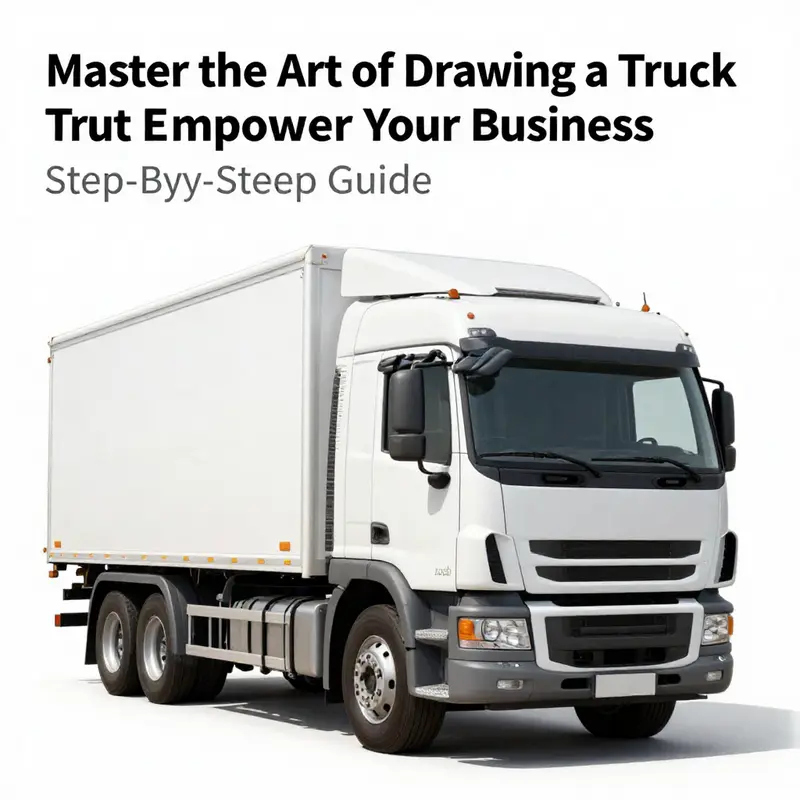
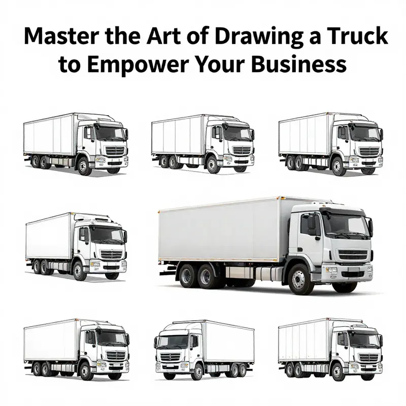
In the competitive world of mobile food businesses, standing out is paramount. One effective way to grab attention and create a memorable brand is through visual representation, particularly in advertising materials. Being able to draw a truck can serve numerous purposes, such as creating logos, menus, and promotional content. This comprehensive guide will delve into the step-by-step process of drawing a truck, as well as the essential tools and materials required, and common mistakes to avoid. Each chapter is designed to build your understanding and skills holistically.
From Box to Beast: A Practical, Step-by-Step Chapter on Drawing a Truck
Materials and a Practical Approach
Drawing a believable truck begins with the right tools and a calm, steady approach. Gather a pencil with a range of leads, a clean eraser, and quality drawing paper. Have colored pencils, markers, or paints ready for the final stage. Use light strokes at first. This lets you refine shapes without fighting dark lines. Keep a ruler nearby for straight edges, but rely mostly on freehand lines to build character and flow. The goal is to work from broad shapes down to details, adjusting proportions as you go.
Start by imagining the truck as a composition of a few simple forms. A long rectangle or rounded box will form the cargo bed. A smaller box or trapezoid at one end becomes the cab. Circles or ovals represent wheels. Once those base shapes sit comfortably on the page, everything else will fall into place more easily. Think of the process as sculpting in two dimensions: you remove and add lines until the truck reads as a solid, functional object.
Keep your eye on balance. A truck should look grounded. That means wheels sit on a consistent baseline, and the body has weight above the wheels. If the cab looks too large, the truck will appear top-heavy. If the bed is too short, it will look stubby and unrealistic. Use simple measuring techniques: compare the length of the bed to the height of the cab. Many trucks have a bed length roughly two to three times the cab height. These proportional rules are flexible. They help you make deliberate changes rather than guesswork.
Begin with a faint horizontal guideline across the page. This line represents the road. Place the wheels along it. Draw a long, light rectangle above the line to represent the cargo area or main body. Place the cab shape at the front of that rectangle. The cab can be a rectangle with a slight slant for the windshield, or a trapezoid to suggest perspective. Keep all initial strokes gentle. These are construction lines, not final marks.
From this point, the process flows logically. Refine the wheels next. If drawing a side view, two wheels are visible; for a three-quarter or three-dimensional view, you may show three or four. Start by penciling circles or ovals that touch the baseline. Keep them evenly spaced. The front wheel often sits slightly forward, under or just behind the cab. The rear wheels typically sit near the back edge of the bed. To make wheels read as round, add smaller concentric circles inside each wheel. These inner circles suggest rims and give you a place to show highlights later.
With wheels positioned, connect them with a gentle curve or straight line to indicate the truck’s underside. Add wheel arches that wrap lightly around the top of each wheel. These arches should follow the wheel curves and attach smoothly to the body. Avoid rigid angles; a truck is made of metal but still reads better with subtle curves.
Now refine the cab. Draw a straight line across the top of the cab to form the roof. Add a slanted windshield by drawing a diagonal line from the roof down toward the hood. Sketch small rectangles for side windows and a long rectangle for the windshield if you desire a front-facing view. Use a thin horizontal divider to indicate the window frame. Place mirrors on both sides of the cab using small rectangles or ovals on short supports. Mirrors are excellent for adding character and scale. They should be proportionate but not oversized.
Add the grille, headlights, and bumper at the front. The grille can be simplified as a set of horizontal or vertical lines. Headlights are circles or rounded rectangles, positioned at the front corners. The bumper sits below the grille and can be a simple rounded rectangle or a more detailed bar with bolts or sections. These features anchor the cab and give the truck a face. Small details like headlight surrounds or a hood line will boost realism.
Shift focus to the bed. If drawing a flatbed truck, extend the rectangle backward and add thin rails along the sides. These rails can be shown with double parallel lines and small posts at intervals. For a box truck, close the rear of the rectangle and sketch doors with seams and handles. If you want a pickup truck, lower the bed slightly and add a tailgate across the back, perhaps with a hinge line and latch. Varying the bed design changes the truck’s purpose and visual appeal.
Add doors on the cab. Use simple rectangles or curved panels to mark door outlines. Position handles as small horizontal ovals near the midline. For realism, suggest the door seams lightly, and place the seam where the cab meets the bed if that fits your model. Draw a small step below each door for access, and consider a fuel cap on the rear side panel. These are small touches that make the vehicle believable.
At this stage, refine the tires. Add tread lines or block patterns sparingly. Too much tread detail can clutter a drawing. Instead, emphasize the rim and a slight shadow where the tire meets the road. Darken the tire sidewall and use a lighter tone for the rim. If you want a metallic look, add a few bright highlights on the rim’s edges.
Details make the truck feel lived-in. Add rivets along the bed rails or a seam where panels meet. Sketch small bolts at junctions and thin lines to indicate sheet metal joints. Suggest a license plate with a tiny rectangle at the bumper. For industrial trucks, add side steps, small toolbox boxes beneath the bed, or hooks for securing cargo. These elements explain how the truck is used and break up large flat surfaces.
Shading and lighting will transform a flat sketch. Decide on a light source early. Imagine a sun or lamp coming from one direction. Shade opposite faces lightly with a pencil. The underside of the bed, the inner wheel arches, and the lower sides typically fall into shadow. Use gentle cross-hatching for softer shadows. Blend pencil tones with a smudge tool or tissue to create smooth gradients. For highlights, reserve small areas of untouched paper or lift graphite with an eraser. Highlights along the top edge of the roof and on chrome surfaces will suggest reflective metal.
Coloring follows the same logic as shading. Choose a dominant color for the body and a few accent colors for elements like rims, bumpers, and trim. Apply color in layers. Start with a base layer and build depth by adding darker tones in shadowed areas. Use lighter tones to suggest sunlit areas. On painted surfaces, leave narrow white lines along edges to simulate reflections. For metallic parts, use a mix of gray and white with sharp contrasts.
Consider perspective to add drama and realism. A simple side view is straightforward. A three-quarter view gives the truck depth and presence. To draw a truck in perspective, begin with a horizon line and one or two vanishing points. Use these vanishing points to angle the bed and cab. Converging lines will make the truck recede convincingly. Remember that objects closer to the viewer appear larger. Wheels closer to the front will be slightly larger than those at the rear in three-quarter perspectives.
If you want a cartoon or simplified truck, the same building-block approach applies. Use oversized wheels, exaggerated proportions, and bold color. Simplify details like grilles and lights into stylized shapes. Cartoon trucks are forgiving, so play with expressions, decals, or patterns. Keep lines clean and bold for clarity.
Practice variations to expand your skill. Draw the same truck from different angles. Change the bed type to flatbed, box, or pickup. Swap wheel styles, add roof racks, or sketch different headlight shapes. When introducing a physical accessory such as a rack, imagine how it attaches to the cab and bed. Place supports where structural members would exist. If you need inspiration on accessory placement and visual options, check resources for roof racks and mounting methods. A helpful reference for different rack ideas is this article on roof racks for trucks. https://trucksdiy.com/blog/roof-racks-for-trucks/
Use reference images frequently. Study photographs to see how light behaves on metal, how seams line up, and how accessories attach to a frame. Don’t copy a photo rigidly. Instead, absorb proportions, angles, and textures. Then translate them into your own version. Reference helps when you tackle more complex views, like a truck tilting on rough ground or turning sharply.
Refinement finishes the drawing. Clean up stray construction marks. Use an eraser to lift unwanted lines and refine the final silhouette. Go over necessary lines with a slightly darker pencil or a fine liner. Keep line weight varied: thicker lines near the foreground and thin lines for distant or delicate details. This variation adds depth and visual interest.
Finally, review the drawing as a whole. Check symmetry in wheel placement and balance between cab and bed. Verify the light source and adjust shadows if needed. Small tweaks now will elevate the piece from a technical sketch to a convincing depiction.
Throughout this process, patience and repetition are essential. Each attempt teaches scale, proportion, and detail placement. Focus on one element at a time, then step back to judge the whole. With each sketch, your trucks will gain solidity and character.
If you want a compact visual tutorial, an external step-by-step guide can offer image-based references. For a clear pictorial approach, see this step-by-step tutorial that complements the techniques described here: https://www.wikihow.com/Draw-a-Truck
Tools in Hand: The Quiet Craft of Sketching a Truck from First Strokes to Finished Form

A truck is more than a chassis and a cabin; it is a language spoken in planes and curves, a silhouette that tells a story of purpose and weight. The act of drawing one begins long before the first line appears on paper. It starts with a choice of tools, a set of habits, and a patient eye trained to translate three-dimensional space into two-dimensional motion. The right materials are not just instruments of craft; they are partners in your observation, helping you transform an idea into a visual structure that feels solid, believable, and alive. In this chapter, we move with a quiet confidence through the toolkit that supports the drawing process, exploring why each tool matters, how it changes your approach, and how you can cultivate a workflow that respects the truck’s form from the broadest shape to the smallest highlight.
Begin with the basics, and let the rest unfold. A good drawing starts with a clean surface, the pencil you trust, and a plan that your hand can follow without hesitation. The pencil is the storyteller’s pencil: it should be light enough to capture the initial ideas and bold enough to leave a trace that you can refine. An ordinary pencil, often graded HB for general sketching and 2B for slightly darker lines, is a reliable starting point. The HB line is soft enough to be adjusted without smudging excessively, while the 2B helps you commit to contours at a comfortable, visible level. The trick is to keep the first strokes deliberately faint, almost like a whisper across the page. These are the coordinates of your truck’s proportions: the length of the cargo body, the height of the cab, the space that will become the wheelbase, and the rhythm of the wheels as they touch the ground.
With pencil in hand, your eraser becomes the second most important tool. A kneaded eraser, in particular, is wonderfully forgiving. It lets you lift lines without tearing the paper or leaving a stubborn residue. In the early stages, use the eraser to refine the silhouette, adjust the proportions, and gently lift away any line that misleads your eye. The eraser also acts as a secondary compass, helping you compare the relative sizes of the cab and the cargo body. The habit of frequently cleaning lines off the page as you go—without erasing the entire structure—prevents the drawing from drowning in stray marks and confusion.
A ruler or a straight edge is the third ally you should invite into the process. A truck’s character rests on crisp, even lines: the bottom edge of the chassis, the straight segments that define the cab, and the clean outline of the bumper. Straight edges help you achieve that mechanical clarity that makes a truck look plausible, especially in a side view where the eye quickly detects any wavering line that suggests a tilt or a misalignment of the wheels. The careful observer will use straight lines sparingly but with intention: to lock down the major planes first, then to guide the more organic curves that define the wheel arches and the cab’s contour. A simple, well-placed guideline can save you from a cascade of adjustments later on.
As you progress from the rough outline to more precise forms, you will begin to think about the line quality that will carry the truck’s personality. This is where the transition to ink and detailing comes into play. A fine-tip marker—one that offers a clean, controlled line without bleeding—becomes the conduit through which your pencil sketch attains finality. Inking is a delicate step that requires a calm pace. Move your hand slowly, letting the marker follow the contours you already established with graphite. The goal is not to redraw every line but to commit to the essential edges: the outer silhouette, the boundaries of the cab windows, and the grille’s horizontal planes. Inked lines should feel confident and purposeful, a decision made after you have tested the lines in pencil and are satisfied with their relation to the rest of the drawing. If you rush this moment, the drawing loses its poised balance and becomes overworked or stiff.
Color is where your truck begins to breathe. Colored pencils, markers, and gel pens each offer distinct ways of translating light, material, and texture. Markers provide bold, flat fields with crisp boundaries that can mimic metallic surfaces when used with care. They can simulate a polished chrome bumper or the gleam on a metal exhaust pipe when layered with lighter tones and deliberate shading. Colored pencils, by contrast, invite subtlety: you can build up translucency, texture, and depth through gradual layers, creating gentle transitions across the cargo body and the cab. Gel pens excel at fine details—a logo, reflection highlights on glass, or tiny chrome accents—adding a sparkle that can transform a static outline into a convincing, lively surface.
When you mix these media, you begin to emulate the truck’s real-world appearance. A common approach is to start with a base color or grayscale under the pencil, then apply markers for the large color fields and solid shadows. After that, you add depth with colored pencils, using light pressure to introduce texture and subtle color variation along the panels, doors, and fenders. Glamor shots of a truck often rely on the interplay of light and metal; your aim is to capture the way light sits on curves, where it intensifies along the upper edges and softens in the shaded recesses of the wheel wells. To evoke a metallic sheen, you can layer a light, almost translucent color over a darker base, allowing the underlying graphite or ink to show through in places. The color story should feel coherent across all surfaces—the metal, the glass, and any painted panels should read as parts of a single vehicle, not separate blocks.
Highlights and reflections are the final polish that can elevate a drawing from a convincing silhouette to a believable, three-dimensional object. A white gel pen or a correction fluid can act as a precise instrument for catching highlights on the glass and metal. Use it sparingly; even a few well-placed dots or thin arcs can mimic the glint of sunlight on a curved windshield or the sharp edge of a chrome strip along the bumper. The key is to assess where the light originates and to place highlights along the most reflective surfaces. This practice not only adds realism but also helps to define the truck’s form more clearly, especially on the front grille, the chrome bumper, and the wheel rims where the light catches in a dozen tiny facets.
Beyond the primary tools, there are auxiliary items that support a smoother, more resilient workflow. Quality sketch paper or drawing pad matters because it influences how the graphite sits on the page and how it holds up under ink and color layers. A surface with a good balance of tooth and smoothness accommodates pencil sketching, ink work, and color layering without grinding or feathering. A sheet that is too slick makes pencil marks smear easily, while a paper that is too textured can hinder precise line work or muddy color transitions. If you are experimenting with white highlights or corrections, keep a small amount of correction fluid or a white correction pen handy to restore white spaces that may have been unintentionally filled by color or graphite. A clean, organized workspace supports a calm pace, and a calm pace is essential when you are translating a three-dimensional form into a two-dimensional drawing.
To sustain progress over multiple sessions, consider the ergonomics of your setup. Sit with your back supported and your drawing arm relaxed, letting your shoulder and forearm carry most of the motion rather than your wrist. A steady posture reduces fatigue and helps you maintain consistent line quality across the length of the truck. Keep your materials within easy reach so you can switch between pencils, erasers, markers, and color tools without losing focus. The rhythm of a good drawing session often follows a pattern: observe the truck’s silhouette, sketch the main proportions with light lines, refine with more deliberate shapes, test and adjust the proportions with quick comparison lines, inking, and then color. Each phase builds on the previous one, with the paper and your hands bearing the trace of your decisions.
The process of building a convincing truck drawing also hinges on understanding its fundamental geometry. A truck’s long, rectilinear body begs for long, clean horizontal lines that establish a rhythm across the chassis. The cab, typically a disparate form—more angular than the body—needs to be integrated with the rest of the mass through careful alignment. One reliable method is to begin by drawing the body as a single, elongated rectangle, then carve in the cab as a smaller, angled rectangle or trapezoid toward the front. From there, you add the roof line that sweeps across the top of the cab, and you sketch the wheel arches as rounded portals that relate to the tire size and spacing. This approach emphasizes the truck’s mass and balance, making it easier to keep the wheels aligned and the stance even as you work from the rough to the refined.
A particularly helpful practice is to work with simple guidelines that you do not commit to final ink too early. Light construction lines can act as scaffolding for the final drawing, guiding where the windshield should sit, where the door windows align with the edge of the body, and how the grille’s horizontal bars will intersect with the headlights. These guidelines are not permanent; they are provisional tools that help you verify proportions, angles, and the overall silhouette. When you are satisfied with the arrangement, you can begin to tighten the lines, switch to ink, and then begin the color work. If you find yourself chasing a line, stepping back to evaluate the proportion against a measure—like the distance from the front bumper to the back of the cargo body, or the ratio between the wheel diameter and the height of the cab—can save you from a cascade of corrections later on.
The truck’s details—the windshield, the door windows, the grille, the bumper—demand attention to how light travels across flat surfaces and into curved recesses. The windshield is a plane with its own slight curvature; it reflects light in a way that differs from the metal of the bumper. The grille’s horizontal bars are not simply lines but planes that communicate the truck’s function and power. When you sketch these elements, you’re not just marking edges; you are creating the machine’s character by translating its mechanical identity into a readable diagram on paper. The tires, too, deserve careful treatment. A tire is more than a circle; it contains tread lines, curves at the contact point with the ground, and reflections that suggest rubber’s texture. Include subtle shading to indicate depth in the wheel wells and to imply the space between the tires and the car body. Even a few fine lines over the tires can hint at spokes or the texture of tread, without distracting from the overall silhouette.
As you near the final stages, your thoughts naturally turn to value and atmosphere. The color choices you make, the placement of the darkest shadows, and the strength of the highlights combine to communicate the truck’s mood. A darker, cooler palette can imply a steel-blue body catching a noon sun, while warmer tones on the metal accents evoke a sense of polished chrome or brass-like reflections. The key is consistency: the light source remains constant, and the way you apply color should reinforce that source. If you choose to render a metallic finish, apply a gradient that transitions smoothly from light to dark along the plan of the body’s curves. If you opt for a matte paint look, you can soften the transitions, letting the texture of the color itself carry depth.
In the practice of refining a truck drawing, you will find yourself developing a habit of pause and review. After a major stage—proportions established, ink lines placed, initial color laid down—step back and consider the drawing as a whole. Do the wheels look aligned? Are the lines consistent in width and tone? Do the highlights sit where they should and reflect the direction of the light? These are questions you answer by comparing the drawing to your mental image of a truck in motion: a vehicle that sits on the road with gravity and purpose, a shape that suggests propulsion and stability. When you notice a discrepancy, return to the pale pencil lines, adjust with an eraser, and reapply your ink with more confidence. The discipline of repeatedly checking your work reduces the need for sweeping, destructive fixes later and preserves the integrity of your initial design intentions.
A final note on the philosophy of drawing a truck: patience is as important as skill. The truck’s mass, balance, and function translate into a sense of weight and energy on the page. This demands a slower pace and deliberate decisions rather than quick, confident strokes alone. Treat each stroke as a step in a larger conversation between light, form, and material. The right tools do not replace practice; they entice you to practice more thoughtfully. As you continue, you will discover your personal preferences for line weight, color technique, and surface texture. You may begin to experiment with layering methods or try new combinations of media to push your truck drawing toward greater realism or toward a more stylized, graphic interpretation. In either path, the fundamentals remain the same: observe, measure, plan, execute, refine, and trust the process.
The materials you choose should support your understanding of the truck’s geometry. For a long, flat cargo body, emphasize straight, uninterrupted lines; for the cab, allow gentle angles that suggest a strong, protective cabin space. The wheels should feel grounded, with the tires interacting with the ground plane in a way that communicates weight and motion. The interplay between pencil, ink, and color will then carry the reader’s eye along the vehicle’s length, convincing them that this is a machine designed for work, travel, and endurance. In this sense, the act of gathering and using tools becomes more than a routine; it is a preparation for seeing. The drawing client—the observer—receives a clear, legible map of the truck’s form and function, built from the quiet, disciplined choices you make with your materials.
For readers who wish to expand their technical awareness, remember that many guides emphasize similar sequences: sketch the body, define the cab, refine the lines, add the wheels, and develop the details with attention to proportion and light. The beauty of drawing a truck lies in the balance between method and intuition. The method keeps you honest about proportion and perspective, while the intuition invites you to capture the truck’s character. With each project, your approach will grow more efficient, and your drawings will become more confident—whether you are rendering a utility vehicle at rest or composing a scene where a truck is captured in motion against a street or landscape.
The chapter closes not with a single verdict but with a readiness to return to the drawing board. You may revisit your initial proportion cues, rework the wheel alignment, or experiment with a different shading scheme. The tools are there to support you, but the only real requirement is to stay curious about how light, space, and structure inform the look of a truck. In that spirit, the practice of drawing becomes not a task to complete but a conversation to sustain, one in which your pencil, your markers, and your choices of color keep pace with your evolving understanding of form. Each stroke you place is a testament to the quiet confidence that comes from preparation, patience, and repeated attention to detail. And as your drawing improves, you will find yourself not merely replicating a truck but translating its essence into a two-dimensional world that feels both plausible and expressive.
External resource for reference: https://www.wikihow.com/Draw-a-Truck
Steering Clear of Common Pitfalls: A Thoughtful Path Through Learning to Draw the Truck
When you set out to draw a truck, you enter a careful dialogue between observation and execution. The road to a convincing likeness is rarely a straight line. It unfolds as a sequence of small, deliberate choices, each choice building on the last. The chapter you’re reading now isn’t about chasing a single perfect sketch in one sweep; it’s about cultivating a mindset that keeps you honest with the truck’s mass, length, and weight. The truck you want to draw is more than a silhouette with wheels. It is a system of shapes that communicates how a vehicle rides the ground, how the cab occupies space, and how the cargo area balances the whole machine. Understanding this balance is where many beginners stumble. They fuse the cab and body into a single block, neglect the relation of wheels to chassis, or rush the moment when the lines must clarify rather than merely suggest. The path to a solid drawing begins with patience, a clear plan, and a willingness to revise several tiny steps before committing to a final flourish.
The first mistake many newcomers make is treating the truck as a single, unbroken form. A long, horizontal rectangle for the body is a logical start, but without dividing lines and thoughtful proportional checks, that rectangle becomes a blunt slab rather than a vehicle with intention. Your eye catches the silhouette; your hand must translate it with proportion. The body’s length should feel appropriate to the wheelbase, and the cab must register as a distinct space—not a mere extension of the cargo area. To avoid this, begin with light, loose shapes that establish a rhythm between the main body and the cab. Think of the drawing as a skeletal map: the main body as a long anchor, the cab as a defined pocket that sits forward of that anchor, and the wheels as three critical contact points that keep everything grounded. The skeleton should feel buoyant yet restrained, ready to carry the details that define a truck rather than merely outline one.
Proportion is not a static measurement that you obtain once and forget. It is a living relationship that changes as the truck’s silhouette reveals its personality. The cab, for example, should not overwhelm the body if you intend to convey a standard, workaday truck. Yet if you’re sketching a particular model with a pronounced cab, you must reflect that emphasis in the relative size and placement of the windshield and door windows. A helpful rule of thumb is to test the proportional map by drawing a simple, light grid over the main shapes. A couple of horizontal guides can help ensure the cab’s height aligns with the body’s line, while vertical guides keep the wheel centers at consistent points along the base. This approach does not lock you into a rigid plan; it simply prevents your lines from drifting into awkward misalignment as you refine the vehicle’s personality.
Another pitfall lies in drawing pressure. Beginners often press too hard too early, creating a finished look before the form has announced its true lines. Heavy marks compress the paper and make erasing feel like a dramatic act, which in turn discourages experimentation. The remedy is to treat every line as provisional. Start with pale, almost ghost-like strokes. If a line proves indispensable, you’ll reinforce it later with a controlled, darker pass. If not, you erase and rework without fear. This practice is not a sign of timidity; it is discipline. When you leave clean, light lines, you preserve options. You leave room to adjust the wheelbase, to tilt the cab slightly if the perspective demands it, and to correct the cab’s tilt without ruining the paper with indentations. Your drawing becomes an evolving conversation rather than a final decree.
Rushing is another traveler’s trap. In the push to reach the end, many learners skip essential steps that anchor a drawing in three-dimensional reality. They skip blocking in the basic shapes, or they move straight to shading and detail without confirming the core geometry. The risk is a misaligned door, an angle that seems to bend rather than sit true in space, or a roof line that looks like it belongs to a different vehicle. Slow down enough to map the truck’s fundamental geometry before you adorn it with features. Sketch the outline of the cargo area first, then inset the cab with its own, slightly forward-leaning angle. The roof line of the cab should feel continuous with the body’s top edge, not a stray line that floats above it. The headlights, hood grille, and bumper then emerge as a coherent cluster of features rather than a scatter of decorative marks. This orderly progression is not a constraint; it is a method for preserving the illusion of mass and function—the essence of a truck, not merely a toy.
Perspective is where the illusion of depth becomes either convincing or flat. A truck drawn with flawless proportions in isolation can still look wrong if the perspective is inconsistent. When you view a vehicle from an angle, your lines must converge toward vanishing points that respect a horizon line. Two-point perspective is enough to convey a truck seen from the front corner: the edges of the body recede toward two separate vanishing points on the horizon. The wheels should remain circular, not ovals formed by a sudden tilt, and the wheel arches should reflect the way the body curves around them. The cab’s windows must follow the same logic: the windshield plane should read as a surface angled toward the viewer, with the door windows decreasing in apparent size as they recede. These adjustments are subtle, but they reveal your growing ability to observe the vehicle’s geometry rather than merely trace its silhouette. Mistakes in perspective seldom announce themselves as a single glaring error. They accumulate as a quiet misalignment that makes features appear glued on rather than integrated into a space that breathes with the truck’s mass.
The temptation to overcomplicate early can derail learning quickly. Some beginners try to push shading, texturing, and complex details before the basic geometry is secure. Textures like chrome, rivets, or tire treads—though appealing—can obscure the underlying form and confuse the eye about where light should land. A more effective plan is to treat texture as a later stage. After you’re confident about the body’s shape, the cab’s profile, and the wheel alignment, you can begin modeling simple surface variations. Represent reflections with restrained, purposeful lines rather than a flurry of cross-hatching. Reserve the boldest contrasts for areas where the light truly meets the surface, like the grille’s recesses or the wheel treads catching the light. By postponing intricate textures, you honor the hierarchy of drawing: geometry first, texture second, color last.
A structured approach is the compass that keeps a drawing on course. Begin with a gentle, doubt-free sketch that captures the truck’s silhouette and major planes. Block in the main shapes with a light hand, then test the relationships among these shapes with quick checks—imagining how the light will strike the figure and whether the vehicle would balance on a single point of contact if it were resting on a slight incline. The method is not rigid; it is a scaffold that can bend as your understanding grows. The trick is to maintain a rhythm between the shapes: long, straight lines for the body, a more compact, angled form for the cab, and circular strokes for the wheels. This rhythm aligns your eye with the vehicle’s obvious geometry—the lines that govern mass and space—so when you begin to add the cabin’s details, you’re still anchored to the trunk’s gravity.
An essential ally in this process is reference imagery. Working from memory is admirable, but a well-chosen reference can illuminate the truck’s unique silhouette, the angle of the cab, the proportion of the windscreen to the door, and how the wheel wells tuck into the body. Keeping a small library of reference images handy can be a practical habit. A simple substitution rule works well: use reference for the big, defining measures first, and allow yourself to deviate later as you gain confidence. If you’re drawing a generic truck, you can still benefit from looking at multiple real-world shapes to refine your sense of how a chassis is organized, how the cab sits above the wheels, and where the roofline transitions into the cargo area. The point is not to copy a single image but to internalize a variety of forms so your own drawing can express a believable, functioning machine rather than a collection of disconnected parts.
As you refine the drawing, you’ll begin to notice how the cab’s features communicate the character of the vehicle. The windshield’s curve and the way it intersects with the door windows define the driver’s field of view and the vehicle’s personality. The grille and bumper convey mass and purpose—how the front end is able to push air and absorb impact. The tires deserve respectful treatment too: they are not just circles but rings that must align with the wheel wells and sit on the same plane as the chassis. Small decisions about tread lines, rim shapes, or subtle tire bulges echo your awareness of the vehicle’s weight distribution. If you make a quick pass with shading to imply volume, you should still be able to locate every line back to the original structural decisions you made when planning the sketch. A correctly shaded surface will feel like a portion of the same object rather than a separate, pasted element.
For a practical moment-to-moment workflow, consider a gentle, patient cadence: start with a light contour; check proportions; adjust for perspective; then add major features. When you’re satisfied with the proportions and the spatial relationships, you can proceed to the interior details: the windshield, the dashboard’s edge seen through glass, the door corners, and the cabinet lines that suggest the truck’s functional space. The headlights should align with the edges of the cab and the body, not float above them; the grille’s vertical and horizontal lines need to echo the front’s mass rather than lock into a grid that looks artificial. The bumper should anchor the lower boundary of the vehicle and read as a sturdy, protective element rather than a decorative line. In this order, you preserve the sense that the truck is a functioning thing in space, not a decorative collage of shapes.
Color and finish come last, but they are not trivial afterthoughts. Once the line work feels secure, you can begin to texture and shade with restraint. A gentle gradient can imply curvature along the body panels, while careful edge control makes the transition from light to shadow legible and natural. The goal is to suggest volume, not to imitate a photograph. Think about light as a storyteller: it reveals mass, it defines where the metal curves, and it hints at the truck’s bulk and purpose. A few decisive dark areas—under the cab, along the wheel wells, and in the grille’s crevices—will anchor the drawing and prevent it from floating in space. If color is part of your plan, approach it with the same discipline you used for the lines. Layer color gradually, testing the hue against the graphite underdrawing to ensure that the finish remains transparent and the underlying form remains readable.
Throughout this process, the patient, iterative mindset pays dividends. You will find yourself revising lines that previously looked indispensable, because you’ve learned to see through the noise of the moment to the truck’s core geometry. The law you live by is simple: good drawing emerges from steady, considered choices rather than sudden, impulsive moves. When you sense the drawing slipping—perhaps a door that seems misaligned or a wheel that sits too prominently on the edge—return to the basics. Rebalance the proportions, recheck the perspective, and reestablish the main planes before you resume detailing. This is how a rough sketch matures into a convincing representation of a truck, with a quiet authority that comes from a well-ordered process.
As you reach the stage where you’re comfortable with the painted surface or colored pencil work, consider the broader context of your practice. The truck is a vehicle that operates in space and time; it exists in traffic, on roads, under sunlight, and in the viewer’s line of sight. Your job is to translate that dynamic presence onto a flat surface. The more you drill down into the sequence of decisions—proportion, placement, perspective, and restrained texture—the more your hand learns to anticipate, rather than react to, the next stroke. You’ll discover that even a seemingly simple subject like a truck rewards patient repetition. Each drawing builds a little more literacy about form and light, and with each attempt, your confidence to render more complex scenes—perhaps a fleet of trucks at a dock or a garbage truck in motion—grows.
The chapter’s closing reflection invites you to treat every attempt as a rehearsal for a stronger, more confident version of your own style. Do not judge yourself by a single outcome; judge yourself by the consistency of your approach and your willingness to refine. When the lines are clean, and the mass reads with credibility, your drawing will carry a quiet message: this is a thing that can exist in space because it has been thought through. The habit of starting with a thoughtful plan, guarding against hasty lines, and letting perspective and proportion guide you will serve not just this truck but every vehicle you draw thereafter. With time, patience, and a steady hand, you’ll find that the road to mastering the truck becomes less about chasing a perfect final image and more about building a reliable toolkit for seeing and translating space onto paper.
In practical terms, you can enhance your practice by consulting accessible resources that align with your goals. For readers who want to explore related ideas about how to extend your drawing practice into real-world projects, the truckboxes approach on the site offers a concise, useful perspective on how accessories and structural considerations influence form in the drawn subject. truckboxes provides a sense of how a vehicle’s features sit in relation to its body, a subtle reminder that even in a static sketch, the relationship between parts matters just as much as the parts themselves. This is a reminder that the learning path is not a straight line of pages turned, but a circle of practice, observation, and revision that continues to feed your growing confidence.
As you move forward, you’ll carry with you the idea that drawing a truck is as much about how you learn as it is about what you draw. The discipline embedded in resisting the urge to rush, in confirming proportions, in controlling line weight, and in honoring perspective, will serve you beyond the page. The road you walk here is long and winding, but it is also forgiving. Each attempt teaches you how to see better, how to translate space with clarity, and how to allow your own voice to emerge through the lines you lay down. The more you practice these habits, the more you’ll discover that your truck drawings begin not as rigid replicas but as expressive interpretations—solid, grounded, and unmistakably yours.
External resource: https://www.youtube.com/watch?v=KZQ1j4Jx6tI
Final thoughts
Drawing a truck is not just an artistic endeavor; it’s a powerful business tool that can aid in marketing and branding. By following the detailed instructions and utilizing the right materials while avoiding common pitfalls, you can create professional visual representations of your mobile business. Mastering this skill can enhance your promotional materials, making your brand more appealing and engaging to your target audience. Embrace this creative journey and let your drawings express your unique business vision.